POST
When and why using dot plots for large datasets
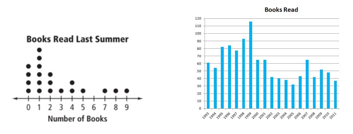
Dot plots are usually recommended for small sets of data, as bar charts are preferred when we need to represent larger sets. However, an interactive chart allows you to manage both “uniqueness” and “volume” of your data set.

Dots or Bars ?
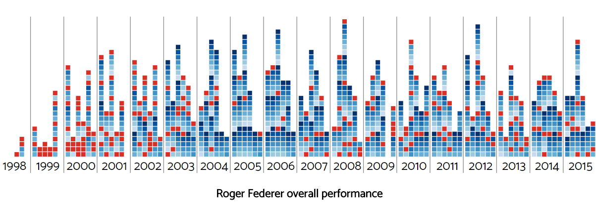
To illustrate this article let’s say that we want to highlight the performance of Roger Federer’s during his long and successful career by displaying his wins and losses.
Based on his ATP stats, Roger Federer has played more than 1.200 matches.
When every item in the data set is important
Dot plots are often used when we want to emphasize the importance of each item, for example when presenting data about people. Using a dot or an icon makes it easier to “impersonate” the data and make it more precious.
Back to our example, every tennis match played is important : different opponents, different tournaments and surfaces, even different rules can lead to diverging results.
Dot plots allow to distinguish every item while maintaining the ability to quickly estimates volumes and proportions.

As you can see, it’s possible here to make a rough estimation of the win rate for each year even if we do not group wins and losses.
When we want to highlight patterns
Dot plots are good to show patterns and frequencies.
Our visualization, allows to spot winning and losing streaks that may be related to different events (injuries, …).
Showing a specific information can be done without reducing our dataset, for example when we want to highlights matches versus a specific opponent :

When transitions matter
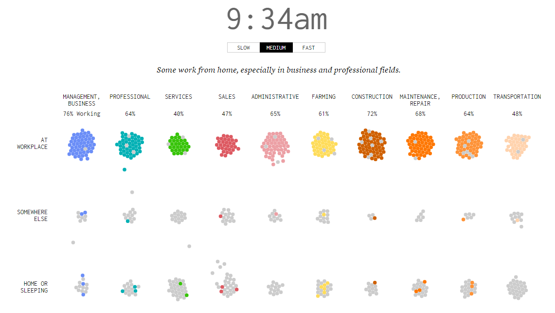
This great visualization on Flowingdata shows the location of people during the day for different types of jobs. What sliding bars could have done, moving dots do it better, by emphasize on traveling time during the day.

When and where people work
When we want to show the size of the data
I just start this article by saying that dot plots are usually recommended for small sets of data. However dot plots or similar visualizations may be used to emphasize the size of your data, we all have several examples of infographics in mind like this one on shark attacks.
The do’s and don’ts of dot plots
Using dot plots instead of a “standard” bar chart is a viable option, even for large datasets but in order to maintain high readability we need to keep in mind these few tips :
- Display data in readable areas, for example by grouping dots in 10x10 squares
- The more data, the fewer colors may be used
- Use simple “units” like dots or squares, mixing different shapes is confusing
- Use a background layout (like a grid) to enhance readability
- Round and factorize huge numbers (a dot may represents a thousand units)
Desktop and mobile devices
Interactivity and readability are obviously tied to the device of your users, so your chart must not depend on clic + rollover behavior to be understood.
On small screens you may want to display your data differently, for example by combining units in bigger groups or by using a responsive design for your layout.
Great dot plots ? Share them !
Dot plots are originals so they tend to have more impact on your users than standard bar charts. They do require a bit more work, as there is no out-of-the-box tool for designing a nice interactive dot plot, but you can shape them with low-level liraries like D3.js.
Hope this article will give you a taste for dot plots, and share your links if you found nice ones !